


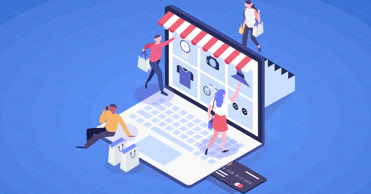
With e-commerce evolving with time, mobile responsive web design is becoming essential. In today’s time, customers want to access the site easily to purchase the products and browse them on their mobile devices. Mobile e-commerce sales were around $314 billion in the last few years, giving 54% of the total sales. Therefore, to stay competitive, it is necessary to have a mobile-responsive web design for your website.
Customers have started navigating your website spontaneously, whether they are using a desktop or a mobile device. And, all this has made mobile phones the fastest-growing channel that offers a seamless shopping experience to consumers. So, if you do not provide a responsive design to the people, then they will surely leave your website. Some of the reasons that a visitor leaves your site are-
- Slow loading process
- Improper navigation
- Non-responsive website
- Poor structure of the content
- Outdated design of the website
Now, you have to provide questions to some of the questions such as,
- Why is the ’mobile first’ way essential to run the business?
- How can the e-commerce website adapt to a more responsive design?
- What is the impact of responsive design in the e-commerce industry?
Therefore, to get answers to all these questions, we will discuss everything in this blog that relates to your e-commerce website and creating mobile responsive designs. And, before we begin, let us know more about mobile applications and website design for e-commerce businesses.
What is Mobile-Responsive Design for an E-commerce Business Store?
The mobile responsive design came into the spotlight by the former CEO of Google Eric Schmidt in 2010. A mobile-first or mobile responsive design is a way to website design and development that previously was a simple process of developing online products and services for mobiles and then changing them for the desktop. A great emphasis on mobile design interfaces offers a good experience to the users that is also very beneficial for e-commerce business stores.
When you have a mobile responsive design, there is no need to manage a lot of websites for your e-commerce business store. You can use one website to showcase content in various ways using responsive design features. The responsive design for e-commerce websites makes it look more flexible to adjust every design to the customer’s screen size. A responsive website boosts traffic as well as sales and helps the business to grow its portfolio, target the right audience, and speed up the website.
Now that you know the meaning of mobile responsive design for an e-commerce business website; let us know the top benefits that you can get from mobile responsive design in the e-commerce world.
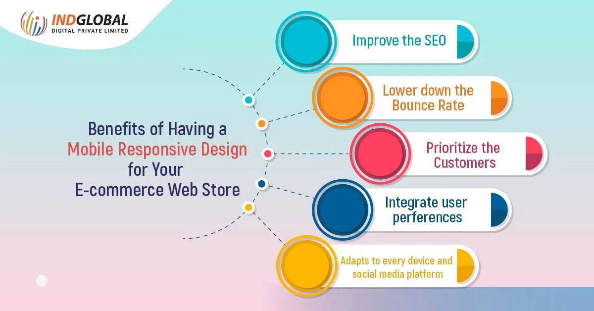
Benefits of Having a Mobile Responsive Design for Your E-commerce Web Store
‘’54% of all e-commerce sales come from the mobile user experience accounts.’’
E-commerce business websites are equipped for mobiles, converting visitors into active customers. Poor mobile optimization can damage the brand image of the company as well as the brand. Also, when the user faces a bad navigation challenge while viewing your website then your branding may also suffer.
Therefore, to avoid such issues, it is important to create a mobile-responsive e-commerce store for your business and get the desired benefits. Here, we have curated the best advantages of choosing a mobile responsive web design for your e-commerce business store.
- Improves the SEO
Responsive design for e-commerce websites lets the e-commerce business stores increase their visibility on the search engines to make your website more visible in search results. Search engine platforms like Google consider only responsive websites and rank them at the top.
Having a responsive design for your business website lets Google crawl faster using only a few websites.
- Lower Down the Bounce Rate
Having a responsive website design will offer you low bounce rates and high rates of conversion. Bounce rates are used to analyze the customer’s percentage coming to your site and then leaving from the home page.
The responsive design for the website results in improved user experience by focusing on the design and look of the website. This also results in automatically getting flexible icons on the user screens.
- Prioritize the Customers
Responsive websites work on a customer-centric philosophy. It delivers a great customer journey which means mobile-responsive website design affects the loyalty of the users and lets them review the brand. Also, with customer expectations and demands increasing day by day, responsive websites stay in competition in the online industry.
One more benefit of responsive design is the customization service that the users get with amazing website responsive design layouts. For example- Indglobal offers a redefined online shopping experience to the customers at Meraj, one of the best wedding wear stores in Bangalore from the comfort of their place.
Being the best website development company in Bangalore, Indglobal helps online businesses to redesign their websites and offer customers a mobile responsive user experience.
- Integrate User Preferences
Almost all mobile users do not let their devices out of sight. Therefore, if the device is handheld, then it is easier to shop online and know about new products and services. With mobile responsive designed websites, it is easy to reach your customers anytime and anywhere.
It becomes easy for the customers to access your products and services from wherever they are and get a good user experience. And, not to mention, all this directly offers your website high ranks in search engine results.
- Adapts to Every Device and Social Media Platform
Responsive mobile-designed e-commerce websites have flexible layouts that help in modifying the size of the templates to easily adapt to every screen size. This makes the display of the website flawless for every device of the future also.
Responsive website design also renders the content pages on different devices by modifying the screen. With attentive and responsive site layouts, it is also easy for the customers to share the products and services with a wide range of audiences.
Rather than these benefits, your website will also load and work faster with a responsive website design. And, now that we know the advantages of mobile responsive e-commerce websites, you should also know some upcoming mobile responsive website design trends for 2023 and the coming years.
Mobile Responsive E-commerce Website Design Trends
As e-commerce businesses started bringing responsive designs for their websites that fit all kinds of screen sizes, some trends do not work on mobile screen sizes. So, it is essential to come across the latest trends every year that come and go every minute. Let us take a look at some of them.
1. Dark Mode
Dark mode is one of the trends that have become popular in the past few years. As the users are shifting more towards dark mode options, letting the website designers add them. The dark mode experience is easy on the eye and offers better and enhanced battery life.
2. Vector Graphics
Vector graphics are the biggest website design and development trends that are used by big e-commerce businesses. These types of graphics have become very popular and provide a huge dimension level and become a big addition to e-commerce web design. Also, vector graphics keep clear images bold in all screen sizes.
3. Single Page Scrolling
If there is a one-page e-commerce website, then it makes the user experience simple and effective so that all the content is seen on a single page. Adding a single scrolling page helps your e-commerce website become more user-friendly and professional. It also helps in getting more engagement and attention from the users.
You can easily search for Indglobal’s best-designed mobile applications or websites by skilled web development service providers in Bangalore for the desired reference.
How Can Indglobal Help You in Designing and Developing a Mobile Responsive Website?
To build a responsive business website, it is essential to create a comprehensive mobile responsiveness to get a top-notch user experience to the mobile users. So, the mobile app and website developers working at Indglobal build mobile applications and websites that provide an almost 80% lower cart abandonment rate. Being the leading website and application development company in India, we have designed and developed some of the best and most renowned e-commerce websites and applications.
The e-commerce web development and design services target retention and conversion such as-
- Mobile app development services.
- E-commerce market assessment and analysis
- E-commerce App Design
- Mobile Wallet Development
- Migration from E-commerce to M-commerce
So, without any further ado, consult our mobile app developers in Bangalore to get started today.
The Final Words
E-commerce web and application development has become very necessary for every business type and brand to run effectively. Being a business owner, you should know that the smart mobile devices market is trending, and desktops are going in the opposite direction. Therefore, it is also time to adjust your mindset when you wish to develop something related to online shopping and get new opportunities. Now, the time has come to know about your stores and start using a responsive website. And, if started, then keep improving the site to satisfy the customer’s needs.
Next Post ←
How to Optimize Your E-commerce Website for Voice Search Features?
Recent Blogs
-
 Top 7 Factors to D..
The e-commerce bus..
-
How to Develop the..
If you have been r..
-
Software Developme..
Just like humans e..
-
Software Developme..
In the ever-evolvi..
-
5+ Benefits of Mob..
In today’s digit..


RELATED ARTICLES
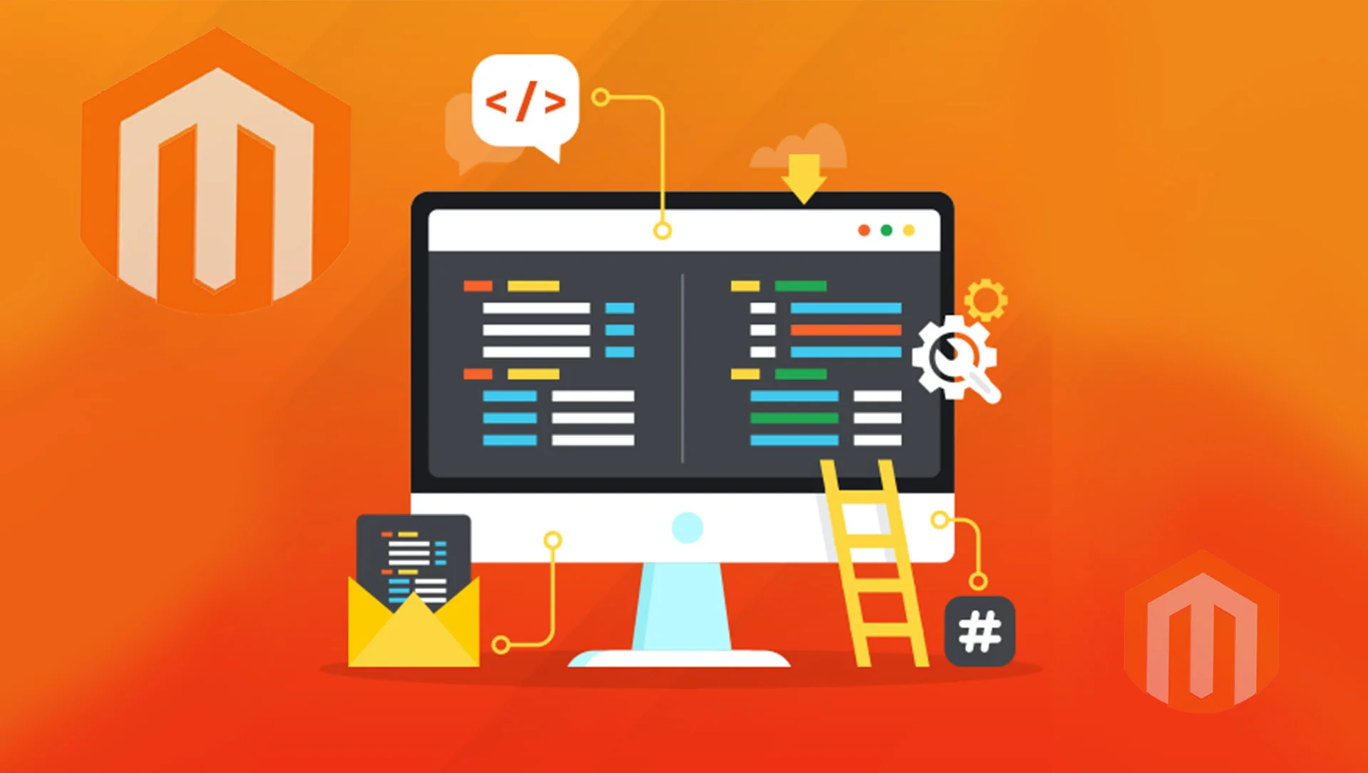
Magento E-commerce Development: Know Its Benefits, Advantages, and Disadvantages
Created by Magento Inc, Magento was released 15 years ago on 31 March 2008, written in PHP language. Magento Commerce…
August 2, 2023

The Pros and Cons of Building Your E-commerce Platform
Looking forward to starting your online business? Perfect! It is the ideal time to enter the field and to stay…
May 5, 2023

How to Optimize Your E-commerce Website for Voice Search Features?
“Alexa, make me a cup of coffee, no sugar, then please find my slippers.’’ Okay, that is not yet possible….
May 3, 2023

The Comparison Between Adobe Commerce and Shopify in 2023
With the expansion of the e-commerce business industry, there are many new businesses that are increasing their market revenues through…
April 20, 2023
7+ Benefits of Using Adobe E-commerce for Your Business Website
The growth of e-commerce is not a new trend in today’s digital world as with the 2020 pandemic people have…
April 4, 2023

7 Ways to Optimize your E-commerce Website for Mobile Users
We are sure that you are reading this using your mobile device. Right? But, what if you do not like…
March 31, 2023

Benefits of E-Commerce Website Development to Business and Its Owners
For the past several years, users have changed their way of shopping and are shifting to new shopping trends drastically….
March 2, 2023
Go vs. Rust: Which One to Choose for Web Development in 2022?
As a web developer, you ask yourself this question several times- Go vs. Rust: Which one to choose for good…
November 23, 2022
Why is Website Maintenance Essential? 10 Reasons to Know
Let us start the blog with an easy question. Is it necessary to maintain your website? And, the answer to…
November 17, 2022
Benefits of Hiring a Leading Web Design Company for Your Business
Online identity for the business in the form of a website is very important today. No matter which industry are…
November 4, 2022
Custom Website Development or Template-based Website Design: Which One is better?
There are several tools and techniques available online that help in developing a website. And, all this comes with different…
October 20, 2022

How to deal with the next challenges in the e-commerce sector?
The post-COVID market has witnessed a surge in eCommerce sales. The eCommerce sectors faced a severe challenge to control the…
September 22, 2020

3 rising trends that reveal the future of e-commerce in SEA
It is for sure that in the latest pandemic state, the growth of e-commerce has been accelerated to a great…
August 10, 2020

Is Drop Shipping the Future of E-Commerce?
Drop shipping is a fairly new phenomenon in the online business sector, which is already touted as the future of…
September 7, 2018

Tips To Choose the Best Ecommerce Development Company to Build Your Ecommerce Store
In the era of urbanization, the majority of the population is diverted towards online shopping and this has a given…
August 27, 2018

Reasons to Prove That Magento Is the Right E-commerce Platform
While it is one of the easiest platforms that can be customized and made according to your convenience, Magento…
July 12, 2018

Why Professional Web Development Is Better than DIY
With technology making everything easy for people in the present times, DIY tutorials and self-help videos have made it even…
June 21, 2018

4 Things to Remember When You Choose an E Commerce Development Company
A recent research concluded that within the next 5 years, globalization would take a drastic turn where people sitting at one end…
June 18, 2018

E-commerce: Trends Shaping its Immediate Future
Gauging e-commerce trends is not solely about quantifying their evolution. 2017, as expected, turned out to be a great year…
June 2, 2018

Best Ecommerce Website Design Company in Bangalore
Indglobal Digital Private Limited is the leading e-commerce website design company in Bangalore that has expertise in delivering the best…
April 12, 2016

website design in bangalore
Indglobal a best website designers in Bangalore and best web developer in Bangalore, we are award-winning web design and digital…
April 11, 2016

Best ecommerce development company in bangalore
E-commerce can be easily understood as the buying and selling of products and services over internet. An E-commerce website makes…
January 20, 2016
Responsive website design company bangalore
We square measure delighted to welcome you to Indglobal internet style development – IT company. we have a tendency to…
April 8, 2015
E-Commerce Hosting
E-Commerce Hosting No matter if you have an internet store, otherwise you unit attempting to begin out one up, Indglobal …
December 22, 2014

Best SEO Company in Bangalore
Are you in search of a top SEO company in Bangalore? You are at the right place. Indglobal Digital Private…
August 2, 2014
Magento website development
We the top and best magento web development company in bangalore, with excellent and outstanding group for services who are…
June 12, 2014
Request a quote or Talk to an expert
We guarantee a response in 6 hours or less. And the best bang for your buck.