


Responsive websites are those that can adapt to all types of screen sizes and different resolutions. According to reports by Statista, mobile traffic gave around 52.64% of global traffic and it is expected to grow by 79% which is an exceptional increase.
Businesses without any mobile websites are getting down as users stop engaging with websites that do not display on their devices. It is very easy for visitors to click a back button and switch to other websites, and also Google ranks websites that do not create responsive design lower in the search.
So, all this means that having a mobile responsive design is more essential than having a desktop website. And, to design a website that can stay ahead of the competitor’s website on the Internet, web designers should be well-skilled and experts at creating responsive web design.
But the question is how to build a responsive design and where to start. No, need to worry when you landed up at this blog. Here, our mobile app developers in Bangalore have curated the right approach to provide a responsive web design. Also, you will get to know about some of the best practices of responsive design and what the future of it is.
A Mobile-First Approach to a Responsive Web Design
Mobile-friendly web designing is the process to design a website for mobiles first and working on the desktop version. There are multiple reasons why this mobile-first approach works well.
- It is easier to scale up the mobile version than scale down the desktop version again because there is no space on mobile websites.
- Mobile web design lets you evaluate what is functionally and visually essential.
- Mobile websites offer easy usability concerns, so it is efficient and practical to focus on mobile design.
Designing a website as a mobile-responsive site lets the mobile designers focus on some of the necessary questions as there is low-screen real estate to work with. The questions are-
- What is the main objective and what are the elements that let users achieve it?
- Is a mobile-responsive site important?
- How to design something that can scale up easily for both mobile and desktop?
- Are the visual effects that are used to develop the mobile-first website worth it?
To get answers to these questions, we will learn about some examples of responsive websites below. But, for now, let us look at which screen sizes, devices, and web browsers are perfect for responsive web design.
Screen Resolutions Relevant for Responsive Web Design
Here are some of the best screen resolutions for mobiles, tablets, and desktop users around the world. As, there is a huge range of screen resolutions, neither desktop nor mobile can dominate the market letting the designers consider all of them when looking for responsive web design.
- 360×640: 22.64%
- 1366×768: 11.98%
- 1920×1080: 7.35%
- 375×667: 5%
- 1440×900: 3.17%
- 720×1280: 2.74%
Just according to devices, the data is segmented by location to match the demographics of the target users. It is also necessary to meet the screen resolutions that have become popular as screen sizes are not so common. Also, screen resolutions help designers develop UX that works even when the market share modifies.
For instance- 360*640 screen resolutions that correspond with Android devices have risen by 5.43% in the last year. Web designers can use important insights like these to start with the website design.
Popular Web Browsers for Responsive Website Design
A responsive design offers a seamless experience to every device, and as different web browsers showcase web pages in different ways, websites should be tested to know that they are compatible with web browsers. Also, making a website match the right responsive breakpoints is necessary for a web developer as it is the web design that decides how UI elements will adapt to several screen sizes.
Here is a breakdown of the share of web browsers for desktop and mobile.
- Chrome: 55.04%
- Safari: 14.86%
- Firefox: 5.72%
- Opera: 4.03%
- UC Browser: 8.69%
Responsive design is not just about fitting everything; it is also about adapting the capabilities of the web browser and hardware as well as the screen resolution of the device. For example- Google Chrome supports the CSS property ‘over scroll-behavior:’ that defines what occurs when the user scrolls hard towards the viewport edge and it is not supported on other web browsers.
Best Practices for Responsive Website Design
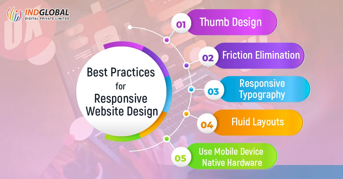
1. Thumb Design
Responsive design UX can sometimes be tricky as the users interact with the website on the desktop via clicks but on mobiles via swipes and taps. Also, there are physical differences as well. Desktop users have computers set on the surface, but mobile users have their devices in their hands. So, all these differences change the way mobile users experience designers’ design taps and other essential elements with which users interact.
Some of the examples are-
- People want the main navigation of the desktop on the top, but on mobiles, it should be at the bottom. Thumbs cannot reach the top easily.
- Other elements’ reach should also be easy. So, keep them in the center of the screen because it is difficult for the thumbs to reach the sides of the mobile screen.
2. Friction Elimination
A mobile responsive approach helps web designers focus on evaluating what is necessary for the users to achieve the main goal. Like, if we build the tablet version of the website, we can begin thinking about user flows, CTAs, and micro-interactions that let users achieve their objectives. It is crucial to focus on the primary goals first and destroy any unnecessary friction.
Here is an example to explain this point in detail-
As mobile user interfaces are hard to navigate, it is best to switch to a one-page checkout process for mobile e-commerce business stores and enable a multiple-step checkout process for desktop e-commerce businesses.
3. Responsive Typography
As UX designers use pixel units to design the website, the web one point is not equal to pixel because there are different screen resolutions. For example, iPhone X has 458 pixels per inch pixel size to let us achieve good graphics within the same physical area. So, for a 16px font size, it would look smaller or bigger according to their screen resolution.
So, web developers should use em units to define the font size, a type of responsive unit where 1em is equal to 1 point. And, for more help, some design tools like Marvel, Zeplin, and Sympli help designers to work with developers to get the best. While developers focus on the code and designers execute the design working in a team that needs good communication.
4. Fluid Layouts
Not all customers can have their desktop browser maximized. This means that when designers consider the responsive breakpoints of mobile devices, they should also take into account what is happening in between the breakpoints. Responsive breakpoints can also be used to ‘reflow’ the content and layout of a new mobile device, but they have to be fluid for all sizes.
So, to design a fluid or adaptive layout, follow these tips.
- Scale up and down the SVG image without losing its quality and making it resolution-independent.
- Use percentage units to allow elements to be fluid.
- Set maximum and minimum widths to enable different bigger and smaller scenarios.
5. Use Mobile Device Native Hardware
Mobile hardware such as GPS services or cameras is not reserved especially for native applications, and as we mentioned above, responsive design is not making everything perfect. It is about adapting to the device’s capabilities. And, with mobile web designing, mobile devices have cameras and some micro-interactions such as data input that are easier for small mobile screens with websites taking advantage of the native hardware.
Some examples are-
- Photo sharing on social media platforms as the media is available on your mobile device.
- Credit card scanning.
- Two-factor authentication because you are using your mobile phones
- A voice search because going hands-free is easier than typing.
The Last Lines
So, this is all about responsive design and how it will affect the future of the online web design world. Use wireframing to crease out the design process, and this fits well when choosing a mobile approach for responsive web design. There is also a responsive breakpoint that will require extra attention. Some mobile web design tools like Marvel let the teams test prototypes on devices, collaborate with other designers until the layout works well, and discuss feedback.
Therefore, to know more about responsive design, employing a team of web developers from the top web development company in Bangalore is the ideal choice to ensure that there is a seamless user experience across different screen resolutions and platforms. Connect with us today and let our skilled web developers in Bangalore help you design a mobile-responsive website and increase user experience.
Next Post ←
The Do’s and Don’ts of Web Design for SEO
Recent Blogs
-
 Top 7 Factors to D..
The e-commerce bus..
-
How to Develop the..
If you have been r..
-
Software Developme..
Just like humans e..
-
Software Developme..
In the ever-evolvi..
-
5+ Benefits of Mob..
In today’s digit..


RELATED ARTICLES

Benefits of E-Commerce Website Development to Business and Its Owners
For the past several years, users have changed their way of shopping and are shifting to new shopping trends drastically….
March 2, 2023

A Guide to Knowing the Importance of Developing a Professional Website for Your Business
With the growth of the online digital world, it has been said that the world is now in our hands,…
February 22, 2023
10 Different Ways to Make Your Website More Accessible in 2023
It is common for transport and buildings to be easily accessible for people. But, have you ever thought about websites?…
December 6, 2022
Go vs. Rust: Which One to Choose for Web Development in 2022?
As a web developer, you ask yourself this question several times- Go vs. Rust: Which one to choose for good…
November 23, 2022
Why is Website Maintenance Essential? 10 Reasons to Know
Let us start the blog with an easy question. Is it necessary to maintain your website? And, the answer to…
November 17, 2022
Benefits of Hiring a Leading Web Design Company for Your Business
Online identity for the business in the form of a website is very important today. No matter which industry are…
November 4, 2022
Custom Website Development or Template-based Website Design: Which One is better?
There are several tools and techniques available online that help in developing a website. And, all this comes with different…
October 20, 2022
UI/UX developers agency in Mg Road
In today’s fast-paced society, the websites or applications that respond quickly and efficiently are the most successful ones. The importance…
December 7, 2017
Top Marketing Consulting Company in Bangalore, India
INDGLOBAL CONSULTING SOLUTIONS is one of the Marketing Consulting Company in Bangalore, India.Few marketing strategy consulting firms that specialised in developing…
June 18, 2017

Website design
Indglobal is a professional Website Design Company in Bangalore for offering affordable web services for the global entrepreneurs. By providing…
March 14, 2017
Website designers in Bangalore & web development company in India
As a reputed website development company in India, IndGlobal is committed to construct robust web solutions for its prestigious clients….
April 11, 2016

website design in bangalore
Indglobal a best website designers in Bangalore and best web developer in Bangalore, we are award-winning web design and digital…
April 11, 2016

Web design company
Indglobal a website design and development company in bangalore, India having over 8+ years of industry experience, our designers contribute…
January 28, 2016

Best ecommerce development company in bangalore
E-commerce can be easily understood as the buying and selling of products and services over internet. An E-commerce website makes…
January 20, 2016

Tips and tricks to design an impressive Landing page
Designing and developing an impressive landing page is not an simple task . Online audience avoid reading through an entire…
November 7, 2015
Web design in Bangalore
Indglobal Digital Private Limited is a leading digital marketing company in Bangalore that provides innovative web development and design strategies…
July 10, 2015
Custom Web Development Services
Custom Web Development Services India: We as Custom Web Development India develops high performance, secure and scalable Custom websites and application with highest…
May 7, 2015
Best Web Development Company In Bangalore
Indglobal net development technologies that ar each verified and sensible. With the choices out there within the market these days,…
April 17, 2015
Best web design company India
Best web design company India No matter how tempting or ingenious your business, if there is no way for your…
September 9, 2014

Best SEO Company in Bangalore
Are you in search of a top SEO company in Bangalore? You are at the right place. Indglobal Digital Private…
August 2, 2014

Website development at affordable price in Bangalore
Online shopping has emerged as the new ruling trend for today’s tech savvy generation and naturally it has become imperative…
July 26, 2014
Website Designing Firm In Bangalore
Website is Globally acknowledged and Preferred media to communicate and to give the information to the customer with all the…
June 16, 2014
Request a quote or Talk to an expert
We guarantee a response in 6 hours or less. And the best bang for your buck.